Agile user experience challenges

Bringing user experience into an agile development process can be challenging, and at this point there is still no cookie cutter formula for implementing it successfully. It is very tempting to believe this formula exists, especially when attending a conference and some presenters speak about how they successfully incorporated UX into the agile process. The reality of integrating user experience in to an agile development process is challenging and it is not done overnight. In this post, there are a few thoughts to consider.

Diana DeMarco Brown’s article “Five Agile UX Myths” posted in Journal of Usability Studies (http://uxpajournal.org/five-agile-ux-myths/) highlights many important points. In my opinion, the most important point was how there are multiple ways to do agile UX and just because the “one sprint ahead” works for one organization, it may not work for others. I think the best thing to do is to gain inspiration from other organizations, and then try different approaches to find out which way works best for your unique situation. To make the transition successful it can be good to be prepared for different issues and problems that may arise. Here are my top 3 things to keep in mind:

  1. UX sprints works fundamentally different than development sprints
  2. Upfront work is important for both UX and developers
  3. User research can still be done even if you move at the speed of light

UX sprints work differently

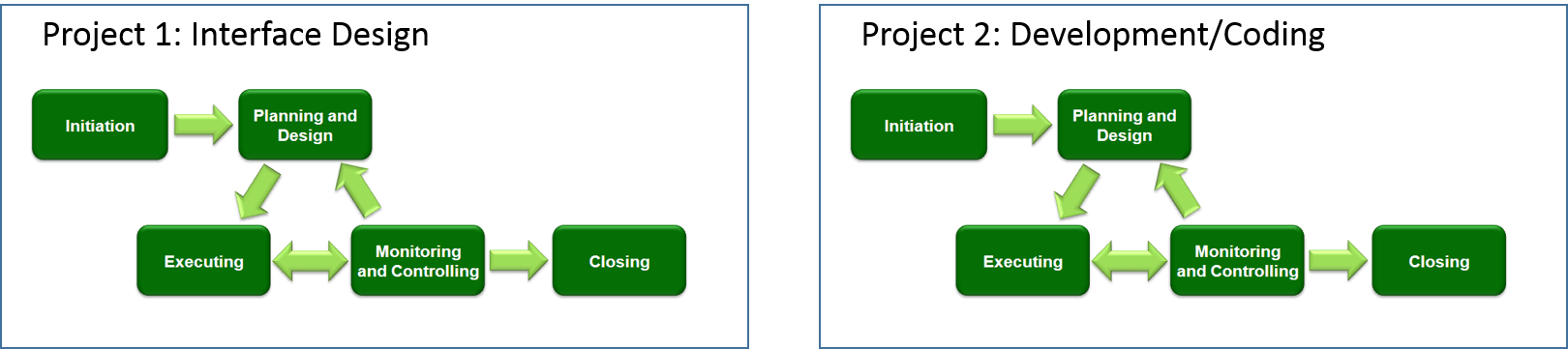
Sophia Voychehovski, brings up an important point in her UX week 2013 presentation (https://www.youtube.com/watch?v=bbPTbN4Q_pw). Her point is that development teams normally split their work into sprints according to functionality (see picture to left), while UX sprints usually cut across functionalities as the fidelity of the design improves with each iteration (picture to the right).

Image showing how development sprints are split into features while UX sprints are split into fidelity level

The reason for this mismatch is that design is approached holistically to make sure the different elements fit with one another across different areas of the design. If the design process is forced to work in development sprints, inconsistencies and suboptimal interactions can occur between different parts of the system. This could cause inconsistency, if one feature might be optimized for the first function, and later on as the next functionality is built, some parts need to be reused (to maintain consistency). However, to support both functionalities the feature may need to be tweaked a bit. Now that tweak has to be in the backlog (on a “to-do” list) of changes for the first functionality. As the process goes on, the backlog will grow even more.

One way to overcome this issue is to allow designers enough time in the beginning of the project to get a holistic view of the system (can be low fidelity). Once they have the overview of the system they can be much more effective working in the developer sprints and most likely decrease the backlog.

Upfront work is important

Many agile projects don’t want any upfront work since that is the “waterfall method” (which is the devil himself). Once the project starts the team has some planning time to create an overview of the project and the product they are creating. The UX project also needs this planning time, the difference is that the UX project often needs a longer planning and exploratory phase than the development team. Unfortunately, most of the time everything has to happen according to the development team’s timeline, so the UX team is super rushed and may not have enough time to prepare and do proper user research.

With incremental improvements of an old system this issue may not be as severe. If only minor tweaks are required, the UX designers already have a holistic view and can therefore jump right in to the development sprints with ease. So, the primary factor for determining the magnitude of this issue is how drastically the system will change.

One client I worked with was both the main UX person in the project as well as the project manager. His general approach was to create a high level design and discuss it with his development counterpart, before a project kicks off. This ensured that they both got a clear estimate of the development possibilities and the effort required for the project. Once they were done with this general planning, they took it back to management for approval of the project. As they presented the project they were able to provide more accurate estimates. (It can be hard to work in this method if you have internal billing, because if the project is not approved no one will pay for the upfront work).

As the project kicks off, he did not disclose to the rest of the team he had already created an overview of the design. Instead, they only discussed use cases and potential issues. He purposely stayed away from discussing solutions, since he did not want the engineers to start focusing on technologies and lock themselves into narrow thinking. After they all seemed to agree about use cases, issues, and features to include, he revealed the design and asked what changes would need to be made to deliver what they discussed. After the team made tweaks, they all had a high level overview of the system. As they started to work in their sprint, everyone understood how the different parts would come together and be presented to the end users in a cohesive way. This method also helps facilitate discussion between developers and UX professionals and enables the developers to provide good interaction ideas and be a valuable asset in the UX process.

Another company handled the upfront work in a completely different way. They included the developers in the upfront UX work. This company worked in tight teams so during the research and design phase, the developers worked alongside the UX lead and became her assistant. This allowed the developers to help develop test scripts, design concepts, etc. and once it was completed they set off to start implementing the new solution. This way of working has many benefits. For example, the developers have a better understanding of the users, they need less clarification regarding the design, and they will have an easier time communicating if any changes are needed.

User research can still be done

Some UX designers who are working in sprints may feel as if they don’t have time for everything. They need to develop designs for the next sprint at the same time as they are answering questions and making sure the current sprint’s design is implemented correctly. Unfortunately, since they don’t have enough time, they sometimes have to sacrifice the inclusion of the user (interviews, usability tests, surveys, etc.).

The best way to solve this issue would be to split up the workload and have one UX designer and one UX researcher. The researcher can set up all research, conduct the research and debrief the designer (or the whole team) in the end. If in-person research is conducted, the key thing to keep in mind is that the researcher will need to plan and schedule participants before they know exactly what the state of the design artifact will be available.

Another solution is to rely heavily on online tools and conduct all research online. Some benefits of online research include rapid turnaround time for participant recruitment, and many of the tools provide good analysis capabilities. If online tools are the solution, make sure to still include a final test, which is conducted in-person. It is important to conduct the final in-person test because many of the panels consist of professional test takers, who tend to be more computer-savvy and overly positive toward system/product, which could skew your research.

Final words

Independent of how you are planning to implement agile UX in the workplace, expect the need to iterate on the process since it will not be perfect from the start. It is also important to try different methods and critically evaluate what worked and what did not work, and how you can improve the process of becoming more agile.

© David Juhlin and www.davidjuhlin.com, 2016

Inside-out vs. outside-in strategy

A company’s strategy can be driven either by internal or external factors. Even though it usually consists of a mix, the strategy usually tends to put more focus on one than the other. The model I use primarily focuses on the three lower levels in my Levels of UX Strategies framework: Company, UX division and project.

inside out_outside in_V2

Inside-out companies

These companies usually look at their internal resources and capabilities then try to find a way to leverage them to reach their business goals. The analysis they use can be Porter’s five forces, SWOT, etc. and from these form a strategy that leverages their strengths and downplays their weaknesses. As they go through analysis they might also identify areas of improvement in order to execute their desired strategy.

For example, a company might create a never-before-seen chemical composition. After discovering it, they have to come up with a utilization of this material in order to monetize it. University spinoffs are a good example of this type of company.

Outside-in companies

Outside-in companies on the other hand start by trying to identify what problems the customers have, then try to figure out how to solve it. After conducting marketing/user research, they might conclude that their customers want a certain product or service to fulfill their needs. Then they try to figure out how they can deliver that product or service to their customers. They might also be looking at competitors and world events that might provide ideas of how to better serve their customers.

For example, Amazon has realized free shipping and rapid delivery are important to customers, so they are continuously trying to improve the delivery time while keeping shipping costs low. Amazon did not have experience with alternative shipping methods such as drones, but they realized it would be a crucial step to deliver packages rapidly so they acquired this competency to satisfy their customers.

Basically, an outside-in company looks for ideas outside of the company, while inside-out companies look within the company.

Considerations at the company level

It might be easy to jump to the conclusion that it is better to be an outside-in company, but don’t be too quick to judge. In the events when customers don’t know what they want, the outside-in company might make the wrong conclusions. For example, would a hotel customer have verbalized they wanted a service such as Airbnb? Or would the cell phone customers have told Apple they wanted Appstore before it was built? These type of innovations usually have to come from ides within the company (or requires an organization with a very high design thinking maturity).

You can also run in to the problem with conflicting “wants” from customers. For example, if Southwest airlines finds out that passengers want to be served lobster on their flights, should they start to serve the lobster? It is true that the customers want it, but they also want a cheap flight. Since Southwest knows their cheap flights are of more value to customers than gourmet meals, the lobster is a “want” they should ignore.

As you can see, it is extremely important for outside-in companies to interpret the research accurately and to understand customers’ underlying desires and how they stack up against each other. This is a very hard task and giants such as Coca Cola made a tremendous fail when they introduced “New Coke”.

I can’t say that one or the other strategic choice is better than the other, but the important thing is that the mix blends well with other strategic decisions that the company makes.
The reason it is important to understand if the company is an inside-out or an outside-in is because it will influence the role of UX within the company. For the companies leaning towards an outside-in strategy, UX can take a more central role and bring new insights and ideas that can lead to initiation of new projects. On the other hand, companies that lean towards an inside-out strategy, the UX role is more as a supportive function that has a limited ability to drive change. Also, within the inside-out company, it might be hard to sell research or design that is based on insights gained from competitors since the culture are more focused on the internal parts of the company.

UX Division

When looking at the inside-out/outside-in scale for the UX division level, it is more about how the UX processes within the division are set up. An inside-out division has more of a focus on building their own methodologies for design and research, while the outside-in company have more of an inclination to search outside the company for inspiration of methodologies.

As an example, let’s say a UX division realizes they need to work in a more agile way. The inside-out division would look inside the company and might notice the developers are using scrum (an agile development method) and then decide to send some staff members to scrum training. This training might even be provided internally from someone in the development team.

On the other hand, the outside-in UX division might send a person to a conference in order to learn how other UX divisions successfully implemented agile methods. Afterwards, they decide if they should use scrum or some other agile method. Once they decide on the method, they can send staff off to third-party training.

In this example, the inside-out division would most likely implement something that works well when collaborating with developers and other divisions in the company, but might not be as efficient within the UX division. The outside-in division would instead find a method that works very well internally, but might not be as efficient when collaborating with other divisions in the company.

Further on, since the inside-out division has a tendency to build their own methodologies, they also tend to have well established processes and methods they rely on. The benefit is a more streamlined process that better predict time estimates. It will also be easier to communicate with other stakeholders that only know the very basics of UX. The outside-in UX divisions on the other hand, tend to allow designers and researchers more freedom in selecting methods and procedures. The benefit of more freedom is that designers and researchers can apply more appropriate methods if it is required.

The strategic choice between inside-out or outside-in will have an impact on the staffing of the UX division. The outside-in companies need more of the “A-type” individuals. Their employees need to be self-motivated, taking initiative, and have a broad skill set so they can apply the right methodologies for different situations. The inside-out company can have more junior employees as well as more of the B and C individuals that might not have enough self-motivation to expand their knowledge on their spare time. The reason the inside-out companies can get away with more junior employees is because they can lean on the processes to support them in their role. This result in the inside-out division being able to operate with a lower cost, not just from a salary perspective, but also since they train employees internally and might not have to send staff off to learn skills unfamiliar to the company.

An inside-out UX division is able to operate on a lower budget. It tries to maximize the value delivered through standardized procedures at the same time as keeping the cost down. Outside-in divisions can often deliver higher quality work for an additional cost. The decision regarding the mix of inside-out and outside-in strategy the UX division consist of depends on the company’s setup and what can provide the highest net benefit for the company. In other words, the UX division should strive for the mix that provide the greatest gap between the additional value created and the cost.

UX Projects

Let’s face it, most UX projects (should) involve users to some extent so it is easy to think of them as outside-in projects where knowledge is gained from participants outside the company. However, UX projects also have inside-out attributes to them. Consider this example. An online company is concerned why their shopping cart abandonment rate is high. Therefore they initiate a project that will investigate this. A UX researcher investigates it and finds out their shipping time is too long.

Another company might launch a project with the goal to see how they can improve the experience for their customers. After the UX researcher has done some investigation they find out that the customers think their delivery times are unacceptable. This example is more of an outside-in project than the first company’s project since this one starts at the user, while the first one starts from the business analytics.

So why does it matter where on the inside-out/outside-in scale the project falls? I would say that it has to do with funding. A project based on internal data (more inside-out) and a concrete problem to solve is more likely to be funded since it is easier to make a business case and gain stakeholder buy-in. I.e. it is clearer what the return of investment will be. When selling the more outside-in projects (more exploratory), the business sponsors (or someone else), whose budget it is coming from, are taking a larger risk than if they invest in a project with a narrow focus. If exploratory studies are important to the organization, one way to circumvent this tendency (to pick the safer projects) would be to provide the UX division with a budget to conduct their own exploratory projects.

Conclusion

The inside-out vs. outside-in framework is very simplified, yet all companies fall somewhere between these two extremes. Even though the framework is simple, it is worth considering where your company/UX division/projects fall and how this impacts your company.

© David Juhlin and www.davidjuhlin.com, 2016

Levels of UX strategies

UX strategies exist in many different levels and here I have tried to break it down to a framework that I find useful. Even if some of the levels overlap to some degree, there are the five main levels: Global, Industry, Company, UX Division, and Project.

Graphic representation of the 5 levels of US strategy. The 5 levels has layers similar to an onion. The furthest out is the Global level, followed by the Industry level, thereafter comes the Company level and the UX division level. Finally the furthest in is the project level.

UX strategy at the global level

On this level we need to consider how UX can impact the entire industry by interacting with other industries. For example, if the grocery store industry makes it easier for farmers to sell their crops to stores through some online system, will more farmers sell to the grocery stores instead of going to the farmers markets? This type of change would most likely increase the number of suppliers and thereby also increase the competition among suppliers, which in turn would benefit the grocery store industry. On the other hand, if all grocery stores provide this system, large farmers may start to use the tool to compare which grocery store would pay the highest price. This will result in unwanted competition in the industry that benefits the farm industry instead.

It is therefore important to understand how your company’s initiatives might change the entire industry if competitors implement the same system. If you don’t consider this level, you might unintentionally make the industry worse off in the long run. It is perfectly fine to make this type of decision that makes the industry worse off, as long as it is a part of the overall strategy and has been planned for.

UX strategy at the industry level

At this level it is important to analyze the competitor landscape and how your company stands in comparison to them. Are you providing a premium product or are you primarily going for lower costs? For example, if you manufacture Mercedes, you might need to spend more on the infotainment system than Dodge. Another important factor here is also to understand if UX is really a differentiating factor. For example, in the coal manufacturing industry, will a better experience on the website really be beneficial?

The reason you need to think about UX strategies on this level is that you don’t want to waste your company’s resources on UX when it actually isn’t that important. What if one of the coal companies would spend a lot of resources to improve their website, when sales primarily is generated through representatives? Would it not have been better to invest in providing training for their representatives or alternatively hire another representative?

UX strategies on the company level

After understanding external factors such as industry effects and your position in the competitive landscape, you are now able to start looking inside your company. At this level, you would be looking at the company’s structure. For example, should the company have an internal UX division or primarily outsource the UX activities?

This is important because you want to make sure the structure inside the company is set up to support the overarching goals. If the UX is critical for the company’s success, but the website design was outsourced. It will be hard to make smaller tweaks and continuous improvements.

UX strategies on the UX division level

The UX division level can be referred to as a functional level in other strategic frameworks. Since we are focusing on UX, I am only looking at that specific function in the company therefore labeled the UX division. At this level you need to analyze things such as processes. For example, should the researchers only be included in the end to test the design? If you have an outsource strategy, this might be enough since the company you outsource the design to should do the upfront research. Another area of consideration should be your staffing. Do you have the right people to fulfill the planned strategy?

The reason this is important is because you need to be able to execute the strategies that you set up. If the company’s direction is to be the UX leader in the industry and you only have designers or only have researchers on your team, this may present great challenges for your strategy.

UX strategy at the project level

In this model, the lowest level is the project level. Sometimes the projects are linked together into a larger project and sometime they are stand alone. This is how UX practitioner traditionally thinks about UX strategy. We try to understand the business goals and the users’ goals, and then create a UX road map. Many times the roadmap needs to be flexible, within limitations, since the project is rarely as linear as you might want. For example, you may do some initial information architecture research and you struggle to get it right (users can’t find information for a critical business goal). This might force the team to spend more time on the information architecture. In turn, this results in not being able to fit the four planned moderated usability tests due to time and/or budget. This could lead to either cuting it down to three moderated tests or conducting two unmoderated tests and two moderated.

It is important to understand UX at this level in order to maximize the UX for each project even though there are constraints (budget, time, resources, etc.). If the company can excel at this level they are off to a good start. They will be able to produce a better UX than expected of a company with similar UX spending.

© David Juhlin and www.davidjuhlin.com, 2016

Know the company’s position in the marketplace before devising a UX strategy

There is not one universal UX strategy that is completely effective for every company. In fact, all businesses must carefully consider how to implement a proper UX strategy around their business and industry. Therefore it is imperative the UX strategy starts on a high level and take the overall business strategy in to consideration.

As the UX strategy is being developed, some of the really important questions that need to be addressed include:
• How important is UX to our company?
• How can we strategically position our UX, given our role in the marketplace?
• Do we have the necessary resources to build out the selected UX capabilities?

Industry can be a major determinant of the level of user experience needed. Online retailers, for instance, would likely want to consider a higher level of spending in UX since their online presence is the main vehicle for interacting with their customers. A local electrician, on the other hand, typically don’t need great UX since they often secure most of their work through referrals from existing clients and sites like Angie’s List. For the handyman, it’s better to focus on the in-person customer experience than creating a hearty digital user experience.

Furthermore, different UX needs may exist for companies within an industry segment. For example, it may be more important for Uber to have good UX than for yellow cabs since Uber relies on in-app sales whereas yellow cabs simply pick people up off the street, with no online interaction.

This is not to say that developing a strong UX is not important for companies, rather that it’s a matter of allocating resources appropriately based on the company’s core competences and position in the marketplace. I believe that many companies underspend on UX as a whole, but even more importantly, they are spending money on UX resources inefficiently because they don’t understand how the UX strategy fits into the larger picture.

A major differentiator for McDonalds is its ability to find locations for new restaurants – a capability they have built up over time. Burger King, on the other hand, tends to follow McDonalds’ lead and expands to locations nearby new McDonalds spots. While there are drawbacks to Burger King piggybacking off of McDonalds’ strategic decisions, they can also enjoy the benefits of freeing up resources and spend elsewhere. Being a follower is not always a bad strategy, if the company can focus their efforts in another business area. In addition, it requires thoughtful consideration about how the UX strategy and team is developed in the company to leverage their position in the marketplace.

For some companies, this means they should abandon their attempts of pushing the boundaries of designs and accepting a follower role. Still we see many companies contracting design agencies to create something “new” and “better” than much larger competitors. For me, this is a puzzling proposition. A company with one-tenth the market cap as Amazon accepts the reality that they would be facing a large uphill battle in replicating Amazon’s delivery and distribution system, but for some reason, with UX, they still seem to believe they can become industry leaders.

Of course, for smaller company with big UX aspirations, there are tactics that can optimize UX spends and build up the necessary capabilities. For those looking to be leaders, such tactics may include properly assessing budgetary allowances for exploratory research and constantly iterating off prior designs through consistent user experience testing. Research is also important for those not seeking to become industry leaders in UX, only that these research efforts may want to start by looking at the UX of high-powered websites in order to understand which elements works best and which do not.

With a better understanding of their place in the market, companies can optimize a vision for their UX strategies. After determining whether to be a UX leader or follower, other things such as budgetary spending and team compositions can be considered.

© David Juhlin and www.davidjuhlin.com, 2016

5 participants is not enough

Many UX experts and gurus have argued that feedback from 5 participants is sufficient for evaluating usability. I think that this may have been true in the past but nowadays, given the changing demographics of tech users, at least 10 participants are usually required for meaningful results. There are many factors that influence the number of participants required for a study and I will try to present my view of these considerations.

5 people standing

The basic starting point is to have at least 3 participants from each unique user group for each task. I think 3 participants is a bit on the low side and my preference is to have at least 4, but ideally 5 participants. Since there may be unforeseen events, all 5 participants may not show up. There are two options for how to get at least 5 participants to show up for your study. The first one is to schedule a standby participant. This is a person who shows up to the testing and is only asked to participate if another participant doesn’t show up. The problem is that this person often has to arrive and wait for several hours. Once you know that you have sufficient participants he is dismissed, but it’s expensive to compensate for this extended time.

The other option is to over-recruit. This means that you schedule 6-7 participants and anticipate that some participants won’t show up. This still tacks on an extra cost, but it is cheaper than having standby participants. The recruit vendors I have been working with at the User Experience Center have a show-up rate (percentage of participants who come to the session) of over 90%. This means that if we schedule 6 participants the probability of at least 5 showing up is roughly 88% (and to get at least 4 to show up it’s approximately 98%). Therefore, scheduling 6 participants provides for the best result.

Now, I also stated “each unique user group to go through each task” so let’s talk about user groups. If a significant difference is expected between user groups it is necessary to recruit 6 participants for each of those groups. If the system is being used by both power users and less frequent users, for example, it is likely they will interact with it differently. Power users tend to rely more on recognition and learned sequences so they are more likely to be able to handle having a lot of information on the same screen as well as having all of the menu options in one large mega menu. Less frequent users, on the other hand, need more assisted direction, so if all the information is cluttered on the same screen they may have a harder time locating what they need. This means that to capture the unique experiences of these two groups, you’d need to double the number of participants for the test.

Another thing to consider when deciding participant count for user groups is age. I have observed over and over again that there is a significant difference between older (roughly around 55 and above) and younger (roughly under 30) study participants. One example is that almost all young participants understand the ‘hamburger menu’ in a tablet application, while approximately 25% of the older population don’t even find the navigation and often think the three lines are part of the logo. During the early ages of the Internet when the common approach was to schedule 5 participants (to have at least 3 show up), all tech savvy people were essentially in the same age bracket. Therefore, it wasn’t necessary (or possible!) to have a cross section of ages represented in the study. Besides familiarity with technology, we also need to consider another factor—vision decreases with age (The importance of accessibility).

Furthermore, the number of participants depends on the scope of the system that will be covered in testing. The more areas that are tested, the more tasks will need to be performed. If there are many tasks, the first thing to do is to increase session length, but I advise against a session longer than 90 minutes since the participant will suffer from fatigue. If all tasks can’t fit in a 90 minute session, one solution is to start to rotate tasks. If the tasks are rotated (each participant performs a randomized set of 10 out of 15 tasks, for example) it is necessary to increase the number of participants since it is desirable to have at least 4-5 participants go through each of the tasks.

Lastly, keep in mind how many platforms are being tested. If there are a few tasks on each platform, it may be possible to allow the same participant to test all the different platforms; otherwise the number of participants will need to be increased.

So far I have primarily discussed this from a “milestone test” point of view (final testing before moving over to the next phase of the design). But there is another type of testing that I call the “sanity check”. The sanity check is a quick test that designers should be doing as they design the interface. These can be conducted with 3 participants and can be done very cheaply though online testing (if there is no confidential information). These sanity checks are for the designer to make sure there aren’t any major issues while also working in a ‘lean’ way.

There are other factors to consider as well (budget, combinations of user groups, etc.), but if these basics are kept in mind the researcher should be in pretty good shape. In summary, most “milestone tests” should schedule at least 12 participants (unless the product only targets one user group), while a “sanity check” can be conducted with as few as 3 participants.

© David Juhlin and www.davidjuhlin.com, 2015

The importance of accessibility

Accessibility is often viewed as a waste of money by many organizations. They therefore often try to get away with adherence to the minimum accessibility standards required by law. I think these organizations may be overlooking one important factor: with an ageing technology-savvy population there is a growing number of customers with some type of disability who benefit from accessibility. The disabilities often referred to when discussing accessibility are:
• Visual impairment
• Cognitive and learning impairment
• Physical impairment
• Hearing impairment

Picture of the four commonly discussed disabilities
The four commonly discussed disabilities: Physical, Cognitive, Hearing, and visual impairment

Visual impairment

Many people immediately think of blind users when discussing visual impairment, but very few are thinking of their own parents. With an ageing population there are many more aspects to visual impairment.

First off, let’s discuss the subgroup of completely blind users. These users rely on screen readers so for them it is crucial the system has been properly coded. It is therefore important to have developers who understand accessibility.

There are many designers that still don’t understand visual impairments, even though their design impacts many users. For example, roughly 7% of males have some type of color deficiency (this does not mean they are completely color blind). For women on the other hand this percentage is less than 1%. Color perception in the eye is based on three colors: red (600 nm wavelength), green (575 nm) and blue (450 nm) and if any of these cones are damaged the person will have problems distinguishing that color as well as mixes of that color. This means that designers need to take the colors selections into account.

Ageing has a significant impact on vision. A  young adult can focus on items about 15-20 cm (roughly 6- 8 inches) away, but the same focus typically is about 87 cm (34 inches) away from the eye at age 60. The retina of a 60 year old also only receives about 33% of the light a 20 year old person’s retina receives. Eye diseases also starts earlier than most people think. Macular degeneration (loss of vision in the center of the visual field) usually starts in the mid-50s and the likelihood of developing cataracts (clouding of the lens) increases with age and tends to affect people over 55. Presbyopia (diminishing ability to focus on lose objects) normally starts around the age of 40, but eventually happens to all people. While Glaucoma (optic nerve damage) usually only affects people over 60, except for African Americans were the threshold is about 40 years. Some of these diseases can be treated, but the individual may not seek medical help immediately and with our ageing population many companies will have users over 60 interacting with their products on a regular basis.

All designers should familiarize themselves with the Web Content Accessibility Guidelines (WCAG), http://www.w3.org/WAI/intro/wcag. In addition, it can be good to have the “SEE” Chrome plugin installed that allows designers to simulate different vision deficiencies, https://chrome.google.com/webstore/detail/see/dkihcccbkkakkbpikjmpnbamkgbjfdcn. Lastly, it can also be good to calculate the contrast difference between the text and background, to ensure that the eye can distinguish between the two http://juicystudio.com/services/luminositycontrastratio.php.

Cognitive and learning impairment

When mentioning cognitive and learning impairment, most people think of the people with severe impairment, while there actually is a broad range of impairment. Cognitive and learning impairment is the most common disability in the population, and in a survey conducted by Microsoft it was found that 16% of working-age computer users in the USA have some type of cognitive or learning impairment.

The issues users with cognitive and learning disabilities encounter are often the same that affect all users, the difference is that these problems pose more severe issues for these users. Since the issues often are the same, normal usability testing can discover and prevent them. However, one thing that may need to be given a bit more attention is content writing. A good general guide line is to try to write text so an average 13 year old can understand it (this also benefit users that have English as their secondary language).

For older users the primary issue is memory. Memory impacts many mental processes such as planning, learning, decision making, etc., so it is important to present things in a clear way. In web design, guiding older users as they navigate between pages is important since they may forget what pages they have just visited. The two main ways to relieve this are 1) to have a clear navigation structure (with proper highlighting etc.) and 2) usage of conventional link colors (unvisited links are in blue and visited are in purple).

Physical impairment

People with disabilities caused from disease and injury represent the second largest group of impaired users. Similarity to cognitive and learning disabilities, there are a wide range of disabilities in this category. Most of these users have some type of assistive equipment to help them interact with the technology. However, there are still things designers can do to improve their experience. When developing a website, follow the Web Content Accessibility Guidelines (WCAG), but also try to navigate the site by only using the keyboard. If you are able to navigate the site using the ‘tab’ button, it is likely that the assistive equipment also is able to do it. Another thing to keep in mind is to make sure clickable areas are large enough so that users with disabilities are able to click them easily.

Hearing impairment

About 8.6% of the US population is hearing impaired to some extent (4.3% worldwide) and about 0.2% can’t hear at all. The hearing impaired can interact with most of the technology online since it often relies on vision and not hearing. The main thing required is to produce captions for videos or transcriptions (which also can help screen readers). This also means it may not be the best idea to use videos in an onboarding process, unless you use captions.

Our capacity to hear diminishes significantly as we grow older. 20% of people between 45-54 years have some degree of hearing impairment, but this figure rises to 75% for people between 75-79 years of age. The ability to hear high pitch sounds is affected first, so it is beneficial to use narrators with low pitched voices when speech is used as the mode of communication (Allstate, for example, avoids this problem by using a narrator with a really low pitched voice https://www.youtube.com/watch?v=q0toJxCvtmI). People who have become hearing impaired later on in life usually don’t know sign language, it is therefore better to provide captions than a sign language translation. Sign language also varies from country to country.

Final Thoughts

As I explained above, the number of people with impairments tends to be vastly underestimated and this population group will continue to increase as the average life expectancy increases. In addition, the subset of severely impaired users are often very loyal to companies that make their lives easier so repeat customers are higher and the churn rate is lower.

My expectations of good designers are that they can both create appealing, trendy designs that users can interact efficiently while taking accessibility into account. This approach will place a limitation on the design to some degree, but it will also make sure the design is not packed with usability issues.

Before dismissing accessibility as an additional expense, really consider what the the cost benefit ratio would be (with a good designer and developer some things are already taken care of) and what additional profit you may gain (increasing population of disabled users).

Sources

  1. Web Accessibility- A foundation for research, Simon Harper & Yeliz Yesilada
  2. Engineering Psychology and Human Performance, Christopher D. Wickens & Justin G. Hollands

© David Juhlin and www.davidjuhlin.com, 2015

Waterfall can be good

Many people advocate agile work methodology, but there are times when the waterfall method is more beneficial. The top things to consider are whether the company has an in-house development team and if the UX team is integrated in it.

Even though it can be difficult to incorporate UX into an agile development process, there are clear benefits to agile development. Since agile basically breaks a project in to many micro projects the main benefit is the ability to respond to market changes and changes in business directions. The overarching idea when incorporating UX into agile is often to have the UX team a few sprints ahead of the developing team which allows the UX team to iterate the design a bit before handing it over to the development team.

However, there are times when it is more beneficial to split the project into two separate projects and revert back to the waterfall method. One example of this is when you don’t have the necessary competencies in-house. For example, an electricity company in Sweden needed a new intranet but they did not have a lot of competency with either UX or coding. At this point most companies would have hired a consultancy that would provide all of the services needed and provide a “functioning system” in the end. We all know how this usually turns out: most of the times the users are neglected and the delivered system is not good enough. The result is to try to fix the issues later on, which results in late and very expensive changes. The reason why this tends to happen is because the purchaser doesn’t know enough about UX and the consultancy can get away with minimal spending on user experience.

Luckily, the energy company in Sweden had a project manager that knew UX and realized he would not have time to make sure the consultancy take all necessary UX steps. The solution for them was to split the project into two distinct phases by sending out two requests for proposal. The first request for proposals was for the system interface and was sent out to different UX consultancies. The goal was to create one clickable prototype without any back-end functionality, but comprehensive enough to clearly communicate the design. Since these companies understood the importance of including users and iterating the design, they discovered unmet needs and additional features they needed to include before it became expensive to make these changes. The final result turned out great and all stakeholders (end users, project managers, project sponsor, etc.) were happy with the interface.

Project split into two distinct phases. Interface design and development

With the interface done, they created the next request for proposals which included the prototype so that all bidders could see exactly what was expected to be delivered and how the system was supposed to work. The benefit was that the developers could get an overview so they could select the right technology/programming language from the start and structure their databases in an efficient way. As an aside, the coding companies also preferred the split proposal method since it decreased their risk (they knew exactly what to build) and they did not have to try to include UX, which was not one of their strengths.

The result was a success and the system worked flawlessly for the users (with some minor bugs) and they did not have to do any late changes. The budgetary split between the two parts of the project was roughly 25% for the first part and 75% for the second part. I believe there are very few consultancies that would take on a contract and allocate 25% of the budget to UX.

When looking into purchasing a system, it can be very tempting to hire one vendor that does all of the work because they charge less, but with all of the late changes that could be necessary, will it really be cheaper in the long run? It can be better to develop the interface first and then ask for proposals, as mentioned earlier. Some industries often purchase out- of-the-box solutions which may have interface limitations. With the split proposal, it is possible to find out what the vendor is unable to build so this can be taken in to consideration when choosing a vendor. They may also suggest their interface solution, which you can evaluate to make sure it is good enough.

The primary benefits of a split project are:

  • Decreases the number of late changes
  • The right technology is decided upon from the start
  • Better estimate of the amount of work required to implement the system

The primary drawbacks are:

  • Significantly increased run time for the project
  • Limits the possibility to account for rapid changes in the business environment
  • Increased upfront investments

Don’t get me wrong, I am not opposed to running projects in a more agile style and overlap different project phases. It is more important to recognize which approach is best for which project (there is none “one fits all”). If you have your UX team and developers in-house and they are working close together, I definitely think you should capitalize on this benefit and run it as agile as possible. The problem is if you outsource the project or if the teams are not considered a unit (you may have internal billing resulting in different goals between the units), you may run into problems.

The final thing to consider is if you are just starting up a UX team in your organization. At this point it may be better to start with a full split between UX design and development. Later on, when everyone gets more used to the process it will be possible to overlap between these two groups. Think of it as, “don’t try to run before you can walk”.

© David Juhlin and www.davidjuhlin.com, 2015

Ethics in Business and User Experience

Business professionals and user experience professionals regularly engage in discussions of ethics. In this post I will highlight a few key points to keep in mind as well as provide insights about how both parties might approach the conversation a bit differently.

Most ethical discussions arise when there is a trade-off between “making money” and “doing the right thing”, but I want to take a step back and consider how ethics and profit interact from a higher level. I use a simplified model consisting of a 2×2 matrix (see picture), with a business dimension and an ethics dimension. The best quadrant is obviously the top right, where there is a win-win solution that is ethical at the same time as the company is making money. For example, IKEA executes some business practices that are good for the environment while allowing them to save money at the same time. Flat packages mean more furniture in each shipment, resulting in fewer transports. This leads to lower fuel consumption, less emissions and ultimately lower costs.

2x2 matrix, the x-axis has unethical to the left and ethical to the right. the y-axis has making money in the top and losing money in the bottom.
Illustration of quadrants for business and ethics.

The bottom right is the charity quadrant. UX professionals usually end up in this one because they see it as their responsibility to speak up for the users and always do “the right thing”. For example, some companies go the extra mile (beyond the legal requirements) to accommodate for accessibility even if they think they will lose money doing so.

The top left quadrant (profit focus) is most often the subject of business ethics discussions. Should something unethical be done in order to make money? There are an abundance of examples to illustrate this question. The classic example is the car sales man who tries every trick in the book to get the customer’s money.

The bottom left quadrant (lose) is obviously not a place anyone wants to be, since it is both unethical and the company is losing money. No company ever intends to lose money as a result of an unethical decision, but it can happen if they misjudge their customers’ reaction. Consider a scenario when a company is outsourcing their manufacturing to a low-wage country and uses child labor to save money and boost profits (the intention is to end up in the profit focus quadrant). Later on it back fires when consumers find out about the company’s practices, leading to a boycott and resulting in a shift to the bottom left quadrant (lose).

The distinctions between each of the four quadrants are not black and white; there are also gray zones. This is because financial outcomes are always uncertain and because ethical boundaries are not always clear. Consider this list of scenarios. Which ones do you think are unethical?

  • IKEA is promoting their consideration of the environment in their business decisions as if these decisions are solely founded on environmental concerns and not on monetary gain.
  • When searching for funds at Fidelity.com, the results page has the Fidelity funds in the top (i.e. not sorted by performance, expenses, etc.), increasing the likelihood that users will choose Fidelity funds.
  • A casino makes gamblers’ exchange money for chips so they lose the sense of “real monetary value”.
  • Some online retailers display “only X left in stock” even if they have more in stock to make it appear as though customers will miss out if they don’t purchase the item immediately.
  • Bakeries pipe air out to the street so people walking by want to come in and purchase goods.
  • Someone is offering to buy your car for fair market value, but you know it has severe defects and should be sold significantly under market value. You still sell your car for the price suggested without disclosing the issues.
  • Airline companies track visitors online and change the price depending on their search/visit behavior instead of actual supply and demand.

As you can see, ethics are not always concrete. When discussing one specific feature/action, one person can see the outcome as ethical while someone else can see it as unethical.

Answering these questions for themselves, many people take the high ground and believe they would behave ethically; unfortunately far too many have poor self-awareness. In a negotiation class in which I was a student, the teacher talked for 1 hour about ethics. Thereafter, it was time for group negotiations. Everyone had confidential information the other party did not know about. The result was astonishing. All ethical considerations had disappeared right away. Rather than disclosing information and acting according to good ethics, most students withheld information intentionally and flat out lied to get the best deal possible.

The class consisted of a mix between business and UX professionals, and there was a tendency for UX professionals to be more transparent, withholding less information and lying less often. If I generalize to the extreme, the business professionals end up in the profit focus corner of the matrix while the UX professionals end up in the charity corner. When working together, it is important to understand where the other side is coming from and that business people are often competitive in nature, causing them to prioritize winning over ethics. Try to understand what is driving the other person and that their decisions and priorities may differ from yours.

For example, I was talking to a business professional who did not think it was unethical for airline companies to set prices based on visitors’ behaviors instead of supply and demand (most visitors think ticket cost is dependent on supply and demand). He believed that this was fair since the airline charges a price (which can change) and the customer can either purchase the ticket or not. Similar to buying any product, the price can vary and in the end the customer can take it or leave it. When I talk to UX professionals, they tend to view this as unethical since there is a lack of transparency. Additionally, business professionals (project sponsors, analysts, etc.) often have a monetary incentive to do more unethical decisions. This is an unfortunate result of evaluating performance primarily on profits.

As a UX professional, It can be hard to make the business case for ethical decisions since the discussions usually surface when there is a discrepancy between profits and ethics (i.e. decisions in the profit focus quadrant and the charity quadrants; those in the lose and win-win quadrant are no-brainers). In order to make a successful business case that merges ethics and profitability, UX professionals need to demonstrate when decisions are actually in the win-win quadrant or the lose quadrant. This is no easy task, but one way is to explain how unethical behavior can have a significant cost in reputation and brand perception, especially if it goes against what the brand’s values. Similarly, unethical behaviors that make the company money in the short-term can potentially damage the brand in the long run. When talking to a business person about an idea they consider to be a charity, it is important to demonstrate when it actually is a win-win. When talking about an idea that is in the profit focus quadrant (unethical), it is important to show that it is actually is in the lose quadrant.

Some additional questions to consider when making the case for the ethical decision can be:

  • Can the charity generate more customers?
  • Can the charity build customer loyalty?

While the tendency exists for UX professionals to reason from an ethical perspective, it is important to be aware of ethics creep. (In the figure, the vertical gray zone is shifted to the left so more outcomes are viewed as win-win or charity.) Every time a person’s ethics are compromised, they rationalize their actions by becoming more flexible in their consideration of what is ethical. This is done subconsciously to protect the person’s view of themselves since most people want to identify with strong ethical standards and avoid cognitive dissonance.

As I mentioned earlier, people can have different views of what is unethical. Here are some ways for you to evaluate whether you think a decision is ethical or not.

  • Could you tell your mom, children, mentor, etc. about your decision without feeling ashamed?
  • Would you be OK if it was on the front page in the newspaper?

Another way to think about it is regarding the intent. If the intent is only to benefit the company, the action is most likely unethical. On the other hand, just because the intent is to benefit someone else, the action may still not be ethical. For example, playing classical music at the entrance of a train station resulted in a reduction in drunken teenagers spending their weekend nights there. This benefitted other travelers, but probably resulted in the teenagers went somewhere else to drink. The new place might be less safe for the teenagers as well as they may cause more problems at the new place compared to the train station. In this case, some may argue it would have been more ethical not to play the classical music.

Ethics is a fuzzy topic and people view it very differently depending on their background. When discussing a decision with ethical considerations, it is therefore important to understand the other person’s point of view while understanding that the final goal often is similar. Everyone wants to ensure that the company remains sustainable while maintaining a satisfied customer base.

Special thanks to Joshua Rosenberg for providing feedback and helping me clarify my thoughts.

© David Juhlin and www.davidjuhlin.com, 2015

New tool from Optimal Workshop

Optimal Workshop will launch a new tool in June (2015), but they are still keeping the details and features of the tool a secret. I have high hopes regarding the tool since I think I know what it will be.

Some of you may know that Optimal Workshop acquired UXpunk a bit over a year ago (I think it was February 2014). My suspicions are that they are integrating some of the UXpunk features into their suite of tools. If I remember correctly, the main feature UXpunk had that Optimal lacked was a method of creating website navigation elements (utility, primary navigation and footer navigation) so they could be tested.

This feature, Plainframe, was a hybrid between a first click test and a tree test. It allowed the participant to click utility links at the top of the page or footer links at the bottom and record it as a first click. At the same time, if the participant clicked the primary navigation, it dropped down and showed sub levels of the navigation (similar to a tree test) and the participant would indicate where in the navigation they expected to find the information. Below is an image where I tried to recreate the look of Plainframe as I remembered it:

Example of how I remembered Plainframe looking like for the participant

When I used Plainframe I felt it was missing a few key features and I hope Optimal has addressed these over the one-year period of integrating the tool into their suite. The main issue I had was the lack of customization of the primary navigation menu. For example, it was not possible to use a megamenu or place the second level menu to the left as a side bar, or as tabs below the primary menu.

I am really looking forward to this new tool since the other Optimal Workshop products are great. They are easy to use and it is easy to analyze the results, which also has improved with their recent redesign of their analysis pages. I guess their recent redesign of the analysis also might have been a step towards integrating Plainframe.

If you want the check out their teaser page for the new tool and have the chance to win a free 5 year subscription, visit the following link https://www.optimalworkshop.com/new-ux-tool .

© David Juhlin and www.davidjuhlin.com, 2015

When should participants consist of a mix between genders?

People with a marketing background have been drilled to make sure there is a perfect mix of participants in the test sample to represent the larger user population they are interested in. In user experience, however, it is often possible to get by with a more lenient recruitment strategy. One of the criteria that can often be relaxed is gender.

Man-and-woman-icon

Men and women can have different perceptions of a brand, different behaviors in their morning routines, different attitudes towards certain sports, etc., but they typically interact with technology in the same way. For example, if men struggle to understand the available balance in their checking account, we can be fairly sure that women would also have issues with this task. Similarly, if females are successful in making an purchase online, men are likely to succeed as well.

Nevertheless, there are some exceptions to this ‘rule’. I have conducted many usability tests and the only time I encountered variations in performance between genders was when we tested a setup of a hardware similar to a printer. Participants were instructed to unpack it from a box and set it up so that they could control it from their smartphone. The box contained an Ethernet cable that was not required for the set up (it was in the box because there may have been some odd cases when it might have been needed). We observed that women read the instructions before they started to plug in all the cables, and realized that the Ethernet cable was not necessary. Around half of the men ignored the instructions and immediately started to plug in all of the available cables, including the unnecessary Ethernet cable.

Some of the men just left the cable hanging from the printer like a tail, while others were determined to plug it in somewhere. One participant found our router (our lab equipment had been moved off to the side in the lab) and plugged it in there. To make sure it did not happen again, we had to hide the router. Another participant saw an Ethernet outlet on the wall and plugged it in there. We had to place a ‘post it’ note on the outlet to hide it. Another male participant plugged the Ethernet cable into the computer we had moved off to the side. We tried to block all of these inputs with cables. Another male came in with his own laptop (he just randomly had it with him) and plugged it into his own laptop. This kept on happening throughout testing and it seemed as nothing we did could prevent the male participants’ from trying to plug in the cable somewhere. We also tried to get the point across by wrapping a tag around the Ethernet cable that said “optional”. Unfortunately, even this was unsuccessful, and the tag ended up being torn off and tossed in the trash before the male participants even read it.

Another example of where gender may have an impact is with fashion or gender-specific items. For example, men probably don’t categorize shoes in as many narrow categories as women might. A man may look at a shoe and say it’s a “flat” or a “heel”, whereas some women can readily categorize a “heel” into “wedge”, “peep toe”, “espadrille”, “pump”, etc.

When recruiting users for testing, always try to get a mix of genders, but don’t put too much emphasis on it unless it is expected that there will be a difference in interaction style between the genders. There are often other criteria that are much more important such as technical expertise and domain expertise. In the shoe example, for instance, women are more likely to have more domain expertise, but there may still be some men who have equal expertise and would have the same type of interaction with the website.

© David Juhlin and www.davidjuhlin.com, 2015